The Learn Loop
Why obvious tests waste money and where breakthroughs hide.
You've watched teams argue over button colors for weeks. Blue or green. Rounded or square. Three pixels or four.
You suspected the real question was somewhere else entirely. You were right.
In 1996, Procter & Gamble had a miracle product.
Febreze could eliminate any odor. Cigarette smoke, pet smell, mildew. The chemistry was real. Hydroxypropyl beta-cyclodextrin molecules trapped odor particles at the molecular level. The product was colorless, odorless, and it worked.
Drake Stimson, a 31-year-old marketer with five years on Wall Street, launched the test in Phoenix, Salt Lake City, and Boise.
Target: people with the worst-smelling homes. Pet owners. Smokers. The hypothesis was obvious. People who live with bad smells will pay to eliminate them.
The product failed.
Stimson's team started visiting homes. In Phoenix, they met a woman who owned nine cats. The house was overwhelming. Stimson's eyes watered within minutes.
He asked how she dealt with the smell.
She looked confused. "What smell?"
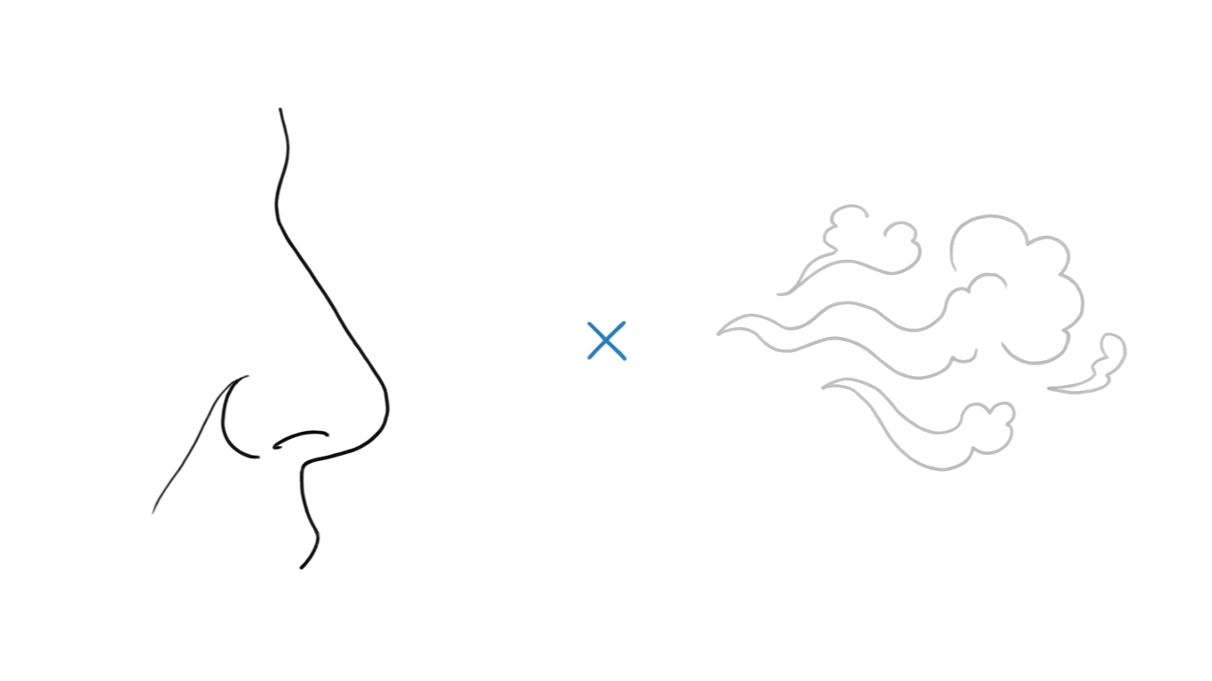
Nine cats. She couldn't smell a single one. Her nose had adapted. The scientific term is olfactory fatigue. Live with a smell long enough and your brain stops registering it.
Then a second visit. A park ranger who got sprayed by skunks regularly. Same pattern. She'd stopped noticing.
The people who needed Febreze most couldn't perceive the problem Febreze solved.
The hypothesis wasn't wrong. It was unfalsifiable. You can't sell a solution to a problem your customer's brain has erased.
Then Stimson saw something he wasn't looking for.
A woman in a clean house. No pets. No smoke. She'd just finished making her bed. She reached for Febreze and sprayed the freshly-made sheets.
She called it "a little mini-celebration."
Febreze wasn't an odor eliminator to her. It was the period at the end of a cleaning ritual. A reward. Not a problem to solve but a habit to complete.
P&G added scent to the formula. Changed the positioning from "eliminate bad smells" to "the finishing touch." Redesigned the ads to show freshly cleaned rooms getting one final spray.
Sales doubled within two months. First-year revenue after the relaunch: $230 million. Today Febreze generates over a billion dollars annually.
The product didn't change. The layer they tested on did.
In January 2009, Tropicana spent $35 million redesigning their orange juice carton. The Arnell Group removed the iconic straw-in-orange image that had defined the brand for decades. Replaced it with a clean glass of juice and a modern, minimalist layout.
The new design looked better. It tested well on aesthetics.
Nobody tested whether customers could find it on the shelf.
Within seven weeks, sales dropped 20%. Tropicana lost $20 million in revenue. Customers wrote in calling the new carton "generic" and "store brand." Neil Campbell, Tropicana's president, announced the reversal on February 23: "We underestimated the deep emotional bond loyal customers had with the original packaging."
They tested preference. They missed recognition.
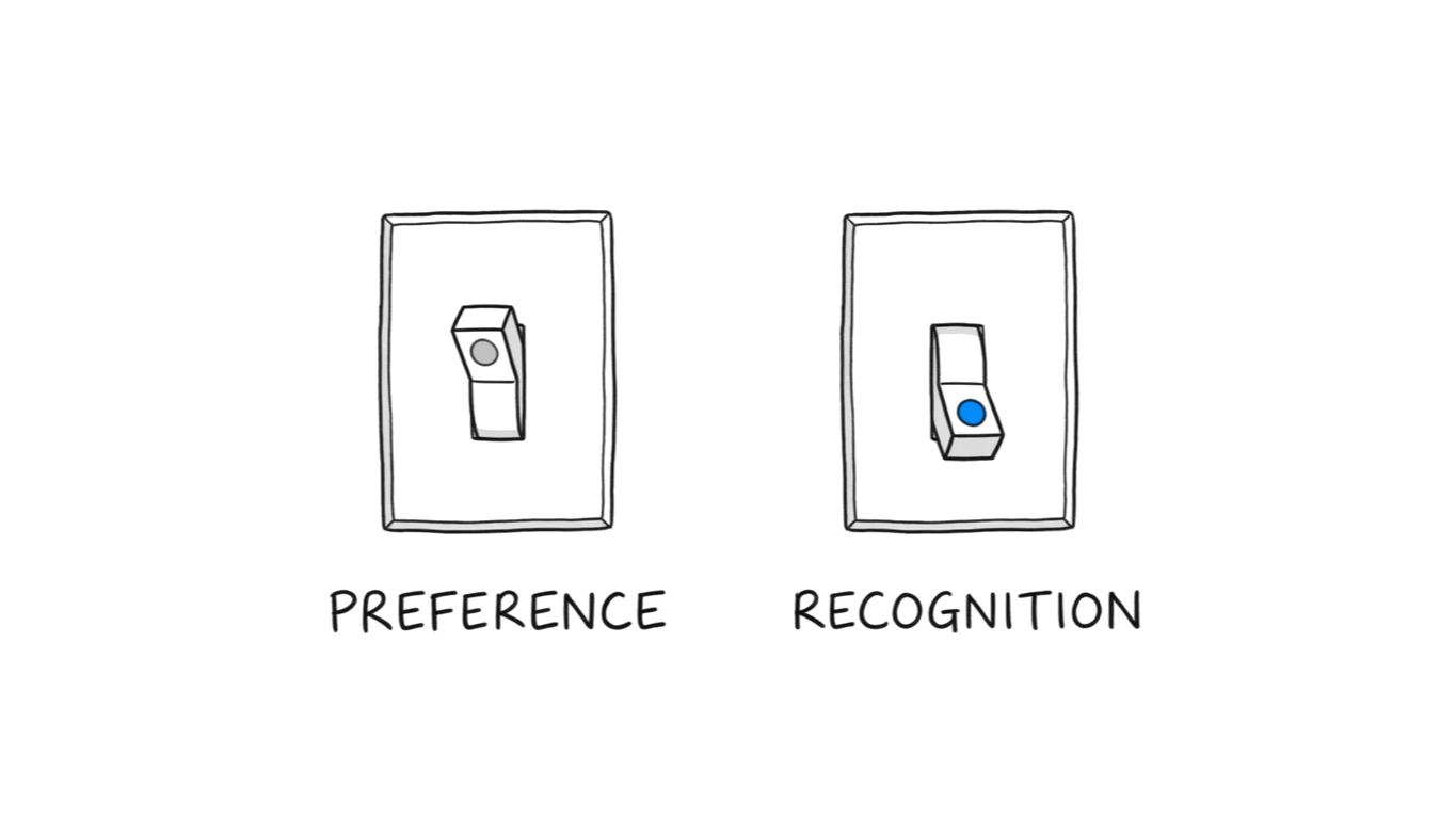
The straw-in-orange wasn't decoration. It was the only reason a hand reached for that carton instead of the one next to it.
In December 2007, Dan Siroker left Google to join Barack Obama's presidential campaign. His first project: optimize the campaign homepage.
Siroker built 24 combinations. Four buttons crossed with six media options. 310,382 visitors split across every variation.
The campaign staff loved "Sam's Video." Energetic. Emotional. Clearly the winner.
It finished last.
Dead last. Out of all 24 combinations. And it wasn't close. Every single video performed worse than every single image.
The winner was a family photo and a button that said "Learn More." Nobody's first choice. The combination that felt least like a campaign ad outperformed the one that felt most like one.
The estimated impact: $60 million in additional donations.
Siroker's reflection: "Had we not run this experiment, we would have very likely used that video on the splash page. That would have been a huge mistake."
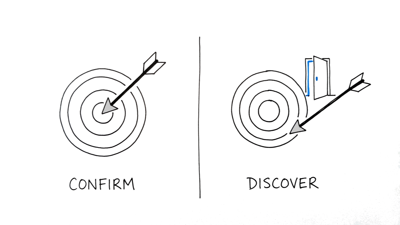
The test didn't confirm what the team believed. It overruled them.
But there's a limit.
In 2009, Doug Bowman resigned from Google. He was their first classically trained visual designer. Hired in 2006 to bring craft to the interface.
Three years later, he wrote a blog post titled "Goodbye, Google."
"Yes, it's true that a team at Google couldn't decide between two blues, so they're testing 41 shades between each blue to see which one performs better."
"I had a recent debate over whether a border should be 3, 4 or 5 pixels wide, and was asked to prove my case."
"Data eventually becomes a crutch for every decision, paralyzing the company and preventing it from making any daring design decisions."
He left for Twitter. Google kept the 41 shades.
Testing everything is not the same as testing what matters. Bowman was the judgment. They tested him out of the building.
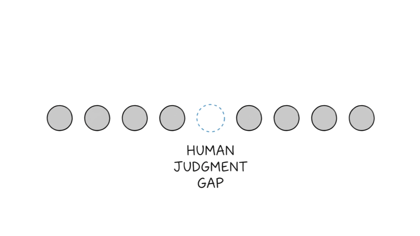
Four stories. Same mechanism.
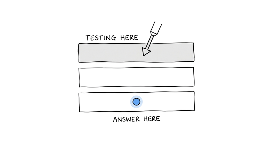
What we call testing is usually confirmation. Running experiments that confirm what we already believe. Safe hypotheses. Measurable variables. Clean results that fit the deck.
The learn loop tests something harder.
Not whether your hypothesis is right. Whether your hypothesis is on the right layer. Whether the question you're asking is the question that matters. Whether your customer can even perceive the problem you think you're solving.
The obvious test is obvious to everyone. That's why the results are always incremental.
The learn loop doesn't optimize answers. It exposes the beliefs you forgot were beliefs.
Empathy tells you who you're talking to. Flip tells you how to shift their perception. Vehicle tells you how to deliver it.
The learn loop tells you which of those beliefs is actually true.
The Empathy Layer shows the four layers that reveal what customers actually want. The learn loop is how you discover which layer you're wrong about.
This is the fourth cylinder of The Perception Engine.